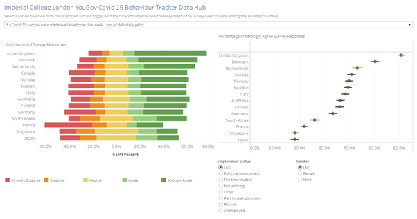
Original Data Visualization
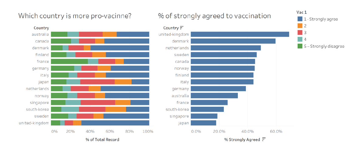
The original visualizations display data originating from a study under Imperial College London YouGov Covid-19 Behavior Tracker Data Hub conducted to understand the willingness of the public to undergo Covid-19 vaccination around the world. Data can be extracted from Github at the following link. A screenshot of the two data visualization produced by one of the research scientists is provided below:
Part A: Critic of the graph for its clarity and aesthetics
The graph is beautiful but confusing.
The graph is beautiful due to the following reasons:
Appropriate choice of colors: In the legend, vibrant colors are chosenw hich are attractive to the reader. The colors are well chosen and are sufficiently contrasting. In addition, there is consistency across both graphs, where the same color was used to represent the proportion that strongly agreed to vaccination.
Graph is sorted: The graph on the right is sorted in descending order. This arrangement is aesthetic and pleasing to the eyes.
Appropriate use of spacing: The space taken up by both graphs is consistent. Both graphs have the same height, and the same width. Despite having different scales on the x-axis, the preparer of the graph adjusted the widths of both graphs such that the length of the first row of the right graph (United Kingdom) is approximately equal to the width of the rows in the left graph. Consistency in the usage of spacing is aesthetic to the reader.
However, the graph is confusing due to the following reasons:
Color scale can be better chosen to reflect ordinal data type: Color scale can be more efficiently used. The x-axis in this question is ordinal where participants of the study can rate their agreement to vaccination from 1 to 5. The ordinal type of the variable can be reflected in the color scale, where both ends of the scale can showcase increasing intensity (from 2 to 1 and from 4 to 5).
Visualize uncertainty of sampling: The graph on the right (% of strongly agreed to vaccination) does not visualize the uncertainty in sampling. Smaller sample sizes have greater errors as surveyors can claim with less certainty that the sample results would be applicable to the population. In visualizing the percentage of survey respondents who strongly agree to receiving the vaccine, we have to visualize the uncertainty involved in sampling to apply the sample results to the population at large.
Unclear title of graph: The title of the graph on the left is unclear. The title is a question ‘Which country is more pro-vaccine?’ and the respondent answer should be the name of a country. However, the graph depicts survey responses that range from ‘Strongly Agree’ to ‘Strongly Disagree’, and the reader of the graph is unable to decipher what the survey respondents are agreeing or disagreeing towards.
Poor comparability across both graphs: In both graphs, the countries are not listed in the same order. The graph on the left has its countries sorted by alphabetical order whereas the graph on the right has its countries sorted by descending order according to the percentage that strongly agreed to the vaccination. To compare a country across both graphs, taking the United Kingdom as an example, the reader would need to look at the most bottom row of the left graph and compare it with the top row of the right graph. It would be much easier to do the comparison if they were in the same row.
Part B: Suggesting an improved alternative graphical presentation
With reference to the critics above, the following suggestions have been proposed.
Color scale can be better chosen to reflect ordinal data type: Instead of using 5 separate colors, a color scale will be used from red to yellow to green which will represent the survey responses ‘disagree’, ‘neutral’ and ‘agree’ respectively.
Visualize uncertainty of sampling: To visualize uncertainty, standard error will be computed based on every country’s sample size and added to the graph.
Unclear title of graph: For greater clarity, the exact survey question will be stated in the visualization so that the user is able to know exactly what survey respondents are agreeing or disagreeing with.
Poor comparability across both graphs: Both graphs will be sorted in the same order of countries.
The proposed alternative data visualization is as follows:
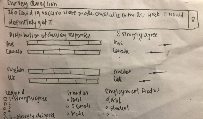
The proposed visualization will contain two graphs. The graph of the left depicts the distribution of all 5 survey responses on the Likert scale. THe graph on the right depicts the proportion of ‘Strongly Agree’ responses and the standard error involved in sampling. The bottom section of the visualization contains the legend of the Likert scale and filters that the user can interact with to see how the parameters ‘Gender’ and ’ Employment Status’ affect both visualizations.
Part C: Designing the proposed data visualization using Tableau
The visualization is available in the following here.
Part D: Description of Data Visualization Preparation
1. Data Extraction from Github
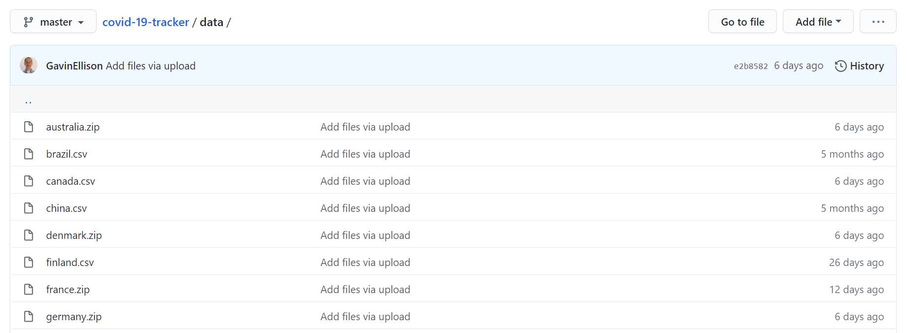
In Github, the datasets are found in the folder ‘Data’ and are listed by countries. For this visualization, we will only be using the 14 countries that are found in the original visualization. Each country’s dataset is downloaded individually. The text files are downloaded as csv files by adding .csv to their file names.
The metadata is also downloaded to help in my understanding of the columns in the dataset.
2. Data Preparation
Every country’s file contains many columns, many of which are not relevant for this analysis. Thus, only the relevant columns are extracted and saved in a separate csv file. The columns are: * gender * employment_status * vac_1 * vac2_1 * vac2_2 * vac2_3 * vac2_6
The columns for ‘gender’ and ‘employment_status’ will be used as filters to breakdown the survey results by this parameters for further insights into how these parameters affect survey responses. While vac_1 was the survey question used in the original visualization, this visualization will also look at the other statements to give a more holistic understanding on the attitudes that survey respondents have towards Covid-19 and the vaccination.
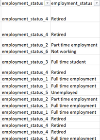
A screenshot of the extracted columns for every country is as follows:

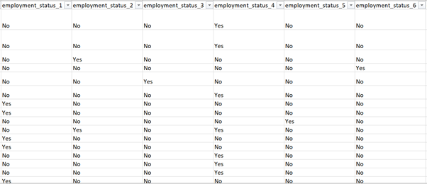
While column extraction is relatively straightforward for most countries, some countries required data manipulation for the column, ‘employment_status’, where it was stored in binary columns instead of a single column, such as follows:
To convert the data into the required form, two columns need to be created. In the first column I used Index and Match in Excel to return the column title corresponding to the value ‘Yes’ for every row. In the second column, based on the rightmost character of the column title (i.e. the number in the legend), I used a lookup table to convert the symbolic numbers into the respective employment status. Both created columns are shown below:
The data file of every country is stored into the same folder for ease of import into Tableau in the upcoming step.
3. Importing data into Tableau
To import the data into Tableau, I created a connection with any of the text files in the folder. This is done through the left pane of Tableau, under Connect > To a File > Text File.
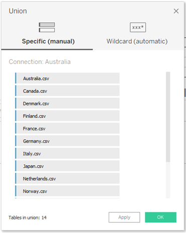
After creating the connection, I removed the text file from the main pane by clicking on the down arrow next to the csv file name > Remove. Then, I create a union by double-clicking on New Union in the left pane. In the pop-up, I drag and drop all the csv files from the left pane (as seen in the figure below), and click apply.
3.1 Renaming Columns and Creating Aliases
Columns should be renamed for greater clarity, and aliases should be created for values where appropriate. The following steps were taken: * As all the survey question columns are stated in codes, I renamed them to their corresponding survey questions based on the metadata. * ‘Table Name’ is renamed as ‘Country’ to better describe the column values * Values in the column for ‘Country’ are renamed to remove the ‘.csv’ suffix * For aesthetics, ‘age’ and ‘household’ are capitalized.
4. Preparing Diverging Stacked Bar Chart
4.1 Creating Calculated Fields and Parameters
Create a new worksheet and rename it as ‘Bar Chart’. The first step would be to create the necessary calculated fields and parameters. A parameter is created by clicking on the black down arrow at the top of the data pane > create parameter. A field is created by clicking on the same black down arrow > create calculated field.
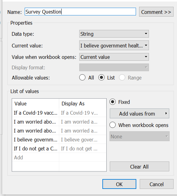
- Create a parameter for Survey Question: A parameter needs to be created for survey question to allow users of the dashboard to select the survey question that they are interested in and observe how the responses change. Name the parameter as Survey Question, set the data type as String and change the allowable value to List. Under List, add all the survey questions as values. A screenshot of the Parameter is as follows:
- Create a calculated field for Number of Records: An indicator of 1 is used for every row for subsequent computations.

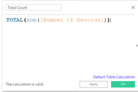
- Create a calculated field for Total Count: This field helps to find the total count of all the records, and it will be used as the denominator of the Percentage in the following calculation.
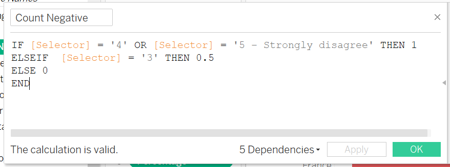
- Create a calculated field for Count Negative: This field helps to find the responses for disagree and strongly disagree, and record them as negative values. Neutral values are recorded as 0.5.
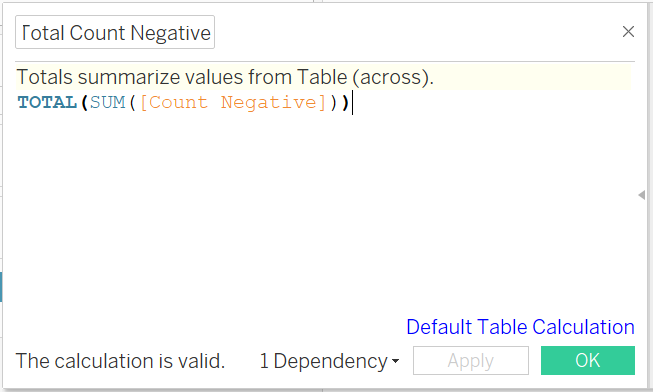
- Create a calculated field for Total Count Negative: This field helps to sum up the Count Negative field.
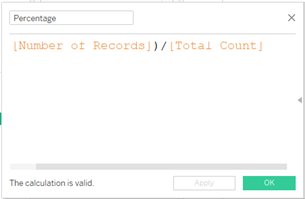
- Create a calculated field for Percentage: Percentage would be used to indicate the proportions of each survey response out of the total count of survey responses for the country.
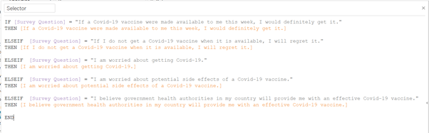
- Create a calculated field for Selector: Selector would be used to indicate to Tableau under the Color marker what survey question column it should refer to. This field would be tied to the Parameter field so that the visualization would change according to what the user inputs.
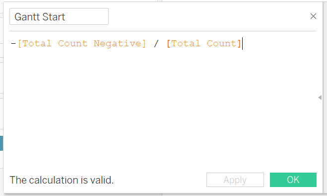
- Create a calculated field for Gantt Start: This and the subsequent field are to compute the values and translate them into Gantt Percentage to be reflected on the graph
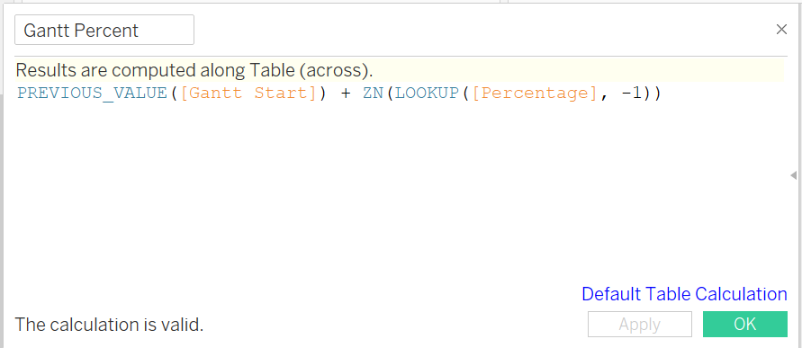
- Create a calculated field for Gantt Percent
4.2 Adding elements to the visualization
After the fields and parameter are created, the basic visualization can be created. ‘Gantt Percent’ can be dragged to Columns and ‘Country’ can be dragged to Rows. Drag ‘Selector’ onto Color under Marks. Under ‘Gantt Percent’, select Compute Using > Selector.
Subsequently, the interactive elements (i.e. filters and parameter) can be added. Click on the down arrow on ‘Survey Question’ and select Show Parameter. Drag and drop ‘Gender’ and ‘Employment Status’ to the filter. Click on the down arrow on both items under the filter and select show filter. Under ‘Selector’, create aliases for 1 to 5 for easy readability of the reader as follows:

Change the Marker from Automatic to Gantt Bar. Drag and drop ‘Selector’ to Color and ‘Percentage’ to Size.
4.3 Formatting the aesthetics of the visualization
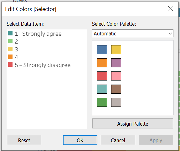
The final step would be to format the aesthetics of the visualization. The first element would be the colors of the legend. As previously mentioned, a scale from red to green will be used. To format the colors, click on the down arrow on the top right of the legend > edit colors. I selected the Color Palette Tableau 20, and chose red, orange, yellow, light green and dark green to represent 1 to 5 respectively. A screenshot of the legend is below:
The next step in aesthetics is to format the axis as a percentage. Right click on the x axis > format. Under scale > numbers, change the settings from Automatic to Percentage and change the nmber of decimal places from 2 to 1. As the axis is also self-explanatory as a percentage, it does not need to be labelled as ‘Percentage’. To remove the label, right click on the x axis > edit axis. In the field for axis titles, delete all characters and leave it as blank.
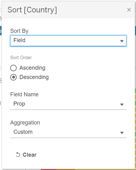
The final step in aesthetics is to format the rows so that they would be sorted in the same order as the right visualization for ease of comparability. Select the down arrow on the Country label in Rows > Sort. Under Sort By, select Field. Under Sort Order, select Descending. Under Field Name, select Prop (a calculated field that would is created under Uncertainty Graph). Aggregation would be automatically selected as Custom. A screenshot of the settings is below:
5. Preparing Uncertainty Graph
5.1 Creating Calculated Fields and Parameters
Create a new worksheet and rename it as ‘Uncertainty Chart’. The first step would be to create the necessary calculated fields and parameters.
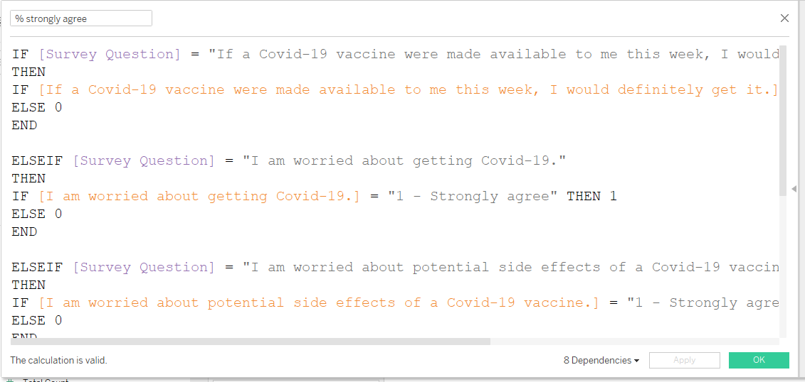
- Creating a calculated field for % strongly agree: As this visualization only focuses on the percentage of survey respondents that strongly agree, I needed to extract this proportion only. For this field to be interactive such that when the Survey Question is toggled to a particular question, values in that column would appear, if-else statements are required. When a survey question is selected, then responses that are ‘1 - Strongly agree’ in a particular column would be denoted as 1, else all other values are denoted as 0. A screenshot of the formula is below.
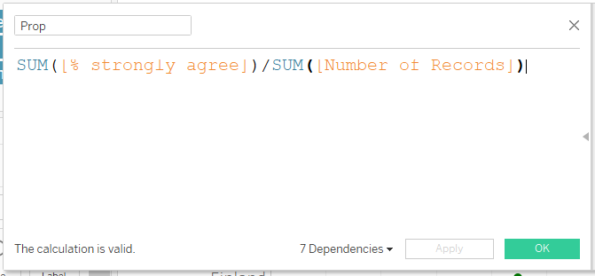
- Creating a calculated field for Prop: Based on the numbers that strongly agree in the previous field, a proportion can be generated based on the sum of the number of records.
- Creating a calculated field for Prop_SE: For this visualization, the confidence interval is computed at 95%. To find the standard error, the proportion is multipled by 1 - proportion. This number is divided by the sum of the number of records, which is the sample size. Finally, this number would be square rooted.

- Creating a calculated field for Z_95%: At a 95% confidence interval, Z = 1.959964 or approximately equals to 1.96. This number is input as a field.

- Creating a calculated field for Prop_Margin of Error: The margin of error is the Z value multiplied by the standard error.

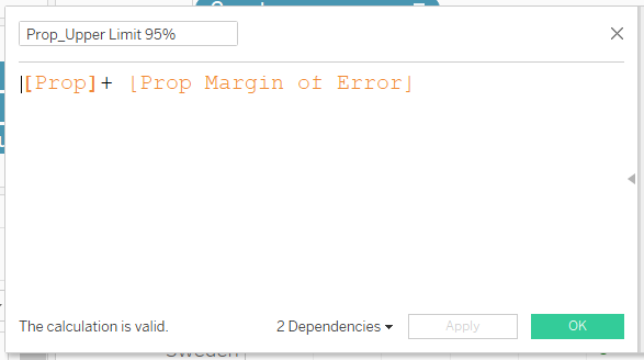
- Creating a calculated field for Prop_Upper Limit 95%: The upper limit would be the proportion plus the margin of error.
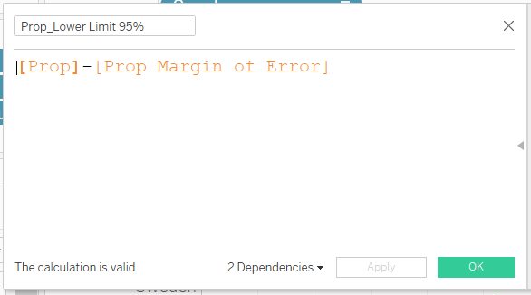
- Creating a calculated field for Prop_Lower Limit 95%: The lower limit would be the proportion minus the margin of error.
5.2 Adding elements to the visualization
Proportion is added to Columns and Country is added to Rows. Marks is changed from Automatic to Circle. Measure Values is added to columns. Under the Measure Values pane, remove all items except for AGG(Prop_Lower Limit 95%) and AGG(Prop_Upper Limit 95%). Under Measure Values, change the Marks from Automatic to Line. In the Measure Values Marks pane, drag and drop Measure Values to Path and remove it from Color.
Click on the down arrow on Measure Values and select dual axis. To synchronize the dual axis, we need to synchronize the axis that has a smaller range of values to the one with a longer range of values. In this case, the bottom x axis has the shorter range of values. Right click on the bottom x axis and select Synchronize Axis.
Similar to the steps recounted under Bar Chart, the filters and paramters are added to the visualization.
5.3 Formatting the aesthetics of the visualization
To ensure that the legend is consistent, the Circle marks representing ‘1 - Strongly agree’ need to be colored the same as that in Bar Chart. Click on the down arrow on Measure Names on the right pane > Edit colors, and select the same shade of green as previously chosen. The color of the line can also be adjusted under Marks > Measure Values > Color. I used a dark grey color to contrast against the white background of the graph, which enhances readability.
Further formatting measures are similar to those in Bar Chart - formatting of the x-axis to 1 decimal place, sorting the graph in descending order.
6. Preparing Dashboard
6.1 Adding elements to dashboard
To create a dashboard, click on the tab ’New Dashboard. In the left pane, adjust the Size to Automatic. Drag and drop both sheets onto the main pane side-by-side.
For the interactivity of the visualization, when toggling the filters and Survey Question, both visualizations should adjust. To link the filter / parameter to both visualizations, click on the panel > down arrow for more options > apply to worksheets > all using this data source. For the filters, we can allow multiple values in a dropdown. Thus, under down arrow for more options, select Multiple Values (Dropdown).
6.2 Formatting aesthetics of dashboard
For aesthetics, a title is added with a short description on how the user can navigate the visualization. As both graphs should take up about the same width and height, a blank is inserted above the graph on the left so that both visualizations can be aligned. A screenshot of the final dashboard is below:
Part E: Major Observations from Visualization
- Attitudes of Survey Respondents to Covid-19 and Vaccination: In the visualization, I included 5 statements that are related to Covid-19 and/or vaccination. These statements can be categorized in the way shown below.
A. Willingness to get vaccinated and concerns about side effects: “If a Covid-19 vaccine were made available to me this week, I would definitely get it.”, “If I do not get a Covid-19 vaccine when it is available, I will regret it.” and “I am worried about potential side effects of a Covid-19 vaccine.”
B. Concern about Covid-19: “I am worried about getting Covid-19.”
C. Trust in the government: “I believe government health authorities in my country will provide me with an effective Covid-19 vaccine.”
There are links between the categories. For example, a country that is willing to get vaccinated is likely to have high concern about the virus, hence there is a link between categories A and B. Another example is that a country is likely to get vaccinated if they have more trust that the vaccine provided by the government is effective, hence there is a link between categories A and C.
I will highlight a few case study countries here, especially the ones that are at the top or bottom of the list for the percentage of strongly agree respondents - namely United Kingdom, Japan, Denmark and France.
United Kingdom is most willing to take the vaccine. It is least worried about the side effects of the vaccination and the most willing to get vaccinated. It is moderately concerned about Covid-19 and have moderately high trust in their government.
Japan is worried about getting Covid-19 but concerned about the effectiveness of the vaccine. It is the country that is most worried about getting Covid-19, but also the country that has least trust in the government on the effectiveness of the vaccine and the top second country to worry about potential side effects. It is thus the bottom-most and second bottom-most country in their willingness to take the vaccine.
Denmark has very high trust in their government. It ranks moderately low in its worry about getting Covid-19, but ranks highest in its trust in the government over an effective vaccine. It ranks second highest in its willingness to take the vaccine.
France has very high concern about potential side effects of the vaccine and high distrust in the government. Thus, it ranks very low in its willingness to take the vaccine.
How gender affects survey responses: Females tended to be less willing to take the vaccine than Males. While Females are more worried about getting Covid-19 than Males, Females are also more worried about potential side effects of the vaccine and have less trust in the government to provide an effective vaccine. The latter turned out to the be the overriding factor that resulted in Females being overall less willing to take the vaccine than Males.
How employment status affects survey responses: Out of all the employment types, retirees were the most distinct and had a noticeably much higher willingness to take the vaccine than the other groups. They also had the highest trust in the government health authorities to provide the country with an effective vaccine.