Original Data Visualization
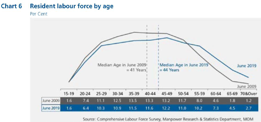
The original data visualization is of Resident Labor Force by Age in Per Cent, and can be found here. A screenshot of the data visualization is also provided below:
Part A: Critic of the graph for its clarity and aesthetics
The graph is beautiful but confusing.
The graph is beautiful due to the following reasons:
Good and consistent color choice: The color choices of blue and grey was pleasant on the eyes and very readable. The choice of both colors was sufficiently contrasting for readers to separate the two visually, but also highly complementary as a color scheme. In addition, there was also consistency between the line graph, labels at the bottom of the graph and reference lines, where grey was always used to denote 2009 numbers and blue was always used to denote 2019 numbers.
All elements are well-aligned and spaced: Elements on the graph, namely the line graphs and annotations, were well-placed for readability. Annotations were placed below the line graph and suitably spaced out so as not to interfere with the line graphs, and so that elements are evenly spread throughout the graph and not concentrated at any part of the graph.
Good choice of dotted reference line contrasts with solid graph line: The reference lines used to represent the median age are dotted, which provides a good contrast against the solid graph lines.
However, the graph is confusing due to the following reasons:
Missing Y-axis: The graph lacks a y-axis which makes it difficult for the reader to interpret the values at points along the line graph. The points can only be interpreted by referring to the values at the bottom of the graph, resulting in poor readability.
Graph does not explain the write-up: The write-up points out key information that were failed to be highlighted in the graph. For example, the write-up mentions about the share of residents aged 55 and over increasing substantially from 2009 to 2019. However, the graph does not highlight this trend as it does not group residents aged 55 and over in one category
Poor choice of graph type: A line graph is suitable in showing a continuous trend. However, as age groups is a categorical data type, each age group is a distinct class on its own it is not useful to interpret a continuous trend across the age groups. As evident in the write-up, there is no reference to trends across age groups within a year. Instead, insights that were generated related to differences across both years in any age-group. Therefore, using a line graph will draw the reader to interpret trends across age-groups, which is not a useful interpretation.
Inappropriate use of reference line: While the intent of the reference line to put an indicator for the median age is clear, the use of a reference along the x axis is inaccurate. While each interval represents an age group, the axis cannot be assumed to have a continuous scale within each interval as the line graph does not have the granularity of data of resident labor force for every year.
Part B: Suggesting an improved alternative graphical presentation
With reference to the critics above, the following suggestions have been proposed.
Adding a Y-axis: To correct the issue of a missing y-axis, we will input a y-axis.
Graphs to explain the write-up: Besides showing the graph for all the age-groups, I will include graphs that will illustrate what was written in the write-up i.e. showing the change in share of labor force for age groups 25 to 54 and 55 & over, as well as showing the change in median age. The graph for all the age-groups is retained to give readers a full understanding of resident labor force by age.
Bar chart: As there is no need for the reader to interpret trends across age-groups, using a bar chart is more appropriate as it highlights that each age-group is distinct on its own.
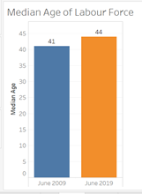
Depicting the change in median age in a separate graph: I will illustrate the change in median age in a separate graph.
The proposed alternative data visualization is as follows:

The proposed visualization will contain 3 graphs. The first graph (top left) depicts the change in resident labor force from 2009 to 2019 for two age groups, which are ages 25-59 and 55 & over. The second graph (top right) depicts the change in median age of the resident labor force. Finally, the bottom graph depicts the change in resident labor force from 2009 to 2019 for all age groups.
Part C: Designing the proposed data visualization using Tableau
The visualization is available in the following here.
Part D: Description of Data Visualization Preparation
This is the step-by-step description on the data vizualiation preparation.
1. Data Preparation
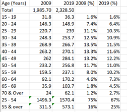
The first step involves extracting the relevant data to produce the visualization. From the report, Table 2 and Table 7 are relevant for data on the median age and resident labor force, respectively. From Table 7, I extracted the columns for 2009 and 2019 into an excel sheet. I then computed the resident labor force percentage by computing the number for each age group over the total provided. I also aggregated the population numbers for ages 25 to 54 as well as 55 & over and computed the respective resident labor force percentage. The resultant table is as follows:
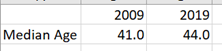
Median age of the resident labor force is extracted from Table 2 as follows, without any need for further computation:
2. Importing data into Tableau
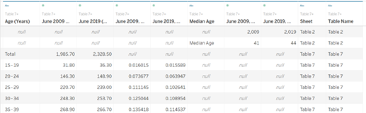
The excel sheet is imported into Tableau. Table 7 and Table 2 are imported as a union into the data source. The resultant table is as follows below. Columns have been renamed for clarity.
3. Creating Worksheets
3.1 Resident Labor Force for all age groups
To create the graph, I need to filter out the rows that are irrelevant. This is done by adding Age (Years) as a filter to only select the 12 required age groups.
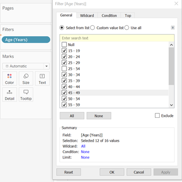
To set up the graph, I filled in the columns and rows. Under Show Me, I selected side-by-side bars. The resultant graph is as follows:

From the intermediate graph, the following steps were taken to improve on the design of the graph:
Removing the x-axis labels: The x-axis labels are wordy and will be very squeezed if the words are aligned horizontally. As the legend already clearly depicts what each color represents, I removed the headers on the x-axis.
Adding mark labels: Mark labels will help to identify the height of each graph. Labels are added by selecting ‘Show mark labels’ under Label. The font size is reduced to 8. To format the number as a percentage, I edited the settings under Formatting of the Pane, and changed the number format to percentage. I also reduced the decimal places to 1 and changed the alignment of the text to horizontal.
Formatting the y-axis: I change the format of the scale to percentage. In addition, I renamed the y-axis as Resident Labor Force by editing the y-axis.
The resultant graph is as follows:
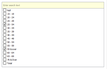
3.2 Resident Labor Force for ages 25 to 54 and 55 & over
The steps to create this graph is like that described for all age groups. However, for this graph, the filtering of age groups is for the 2 required age groups, as seen below.
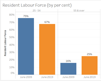
Like the previous graph, I added mark labels (but in this case, to 1 decimal place only) and formatted the y-axis. For the x-axis, I edited the alias of the headings. The resultant graph is as follows:
3.3 Resident Labor Force Median Age
As Tableau includes the header as a row, I must filter out the median age.
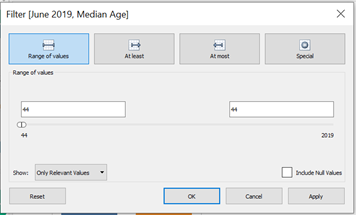
Filling up the column and rows, and formatting the title, axis labels and mark labels, I derived the following graph:
4. Combining Worksheets in a Dashboard
To display all graphs in a single sheet, the dashboard is utilized. The graph of the resident labor force of all age groups is the widest for all the mark labels to be displayed clearly with less overlap. Hence, it is in a row of its own. A title is also added as a descriptor for the graphs. I ensured that the axes for both graphs were of the same scale for easy comparison between both graphs.
Part E: Major Observations from Visualization
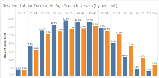
For age groups intervals of 5 from 20 to 54, resident labor force decreased from 2009 to 2019. However, for age groups of 5 from 55 onwards to 70 & over, resident labor force increased from 2009 to 2019. This reflects two very distinct trends in the resident labor force for all age groups where all age groups fall into either category, with the exception of age group 15-19 where resident labor force remained constant.
The mode age group interval (i.e. age group with the highest occurrences) is 35-39 for 2009 and 45-49 for 2019. For 2009, the mode age group is lower than the median age whereas for 2019, the mode age group is higher than the median age. This could suggest that the 2009 distribution is right-skewed whereas the 2019 distribution is left-skewed.
Distribution of resident labor force in 2019 is much more even than in 2009. In 2009, the top 3 age groups with the highest share of resident labor force exceed 13% whereas in 2019, none of the age groups’ share of resident labor force exceed 13%. In 2009, the lowest 3 age groups are below 2% whereas in 2019, only the lowest age group falls below 2%.